Performance
This module is used to view real time statistics and/or collected baseline performance data from individual servers tracked over time, and to create customized charts for trouble-shooting or comparison.
Note: Upon exit from this screen, any charts that have been created are deleted and the Category is reset to the default. To avoid recreating the charts, it is recommended that duplicate tabs be used to toggle between modules.
To download a picture (not a spreadsheet) of a chart, click the 3-DOT icon in the card header and select Export.
Overview
WISdom uses Windows Performance Monitor (PerfMon) objects and counters to monitor SQL Server activities. The Category (object) selected determines the Metrics (counters) and (PerfMon) Instances displayed.
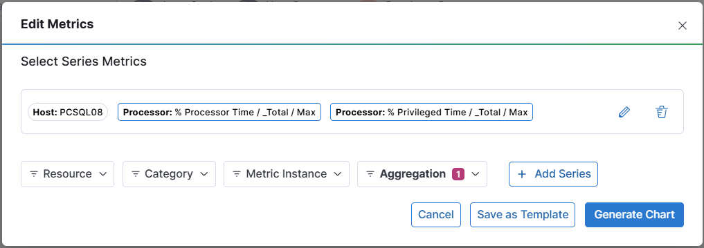
When prompted, select one (1) or more Metric from the Metrics drop-down menu and click the Add Series button to populate the chart. The filters and date range selected are displayed on the card tool bar. Each Metric selected is added as a color-coded plot line on the chart.
Use the drop-down menus to change the visualization, as follows:
- Server - All SQL server Instances (default)
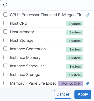
- Category - PerfMon object (default is Processor)
- Metric - PerfMon counter for the Category (object) selected
- Instance - Number of the Instances of the Performance Counter Aggregation Average (default), Min, Max, Percentile 97%, Percentile 90%
- [+ Add Series] allows the addition of additional series to the same chart.
- [Save As Template] will save the configured series as a template for quick access in the future.
- Note that series can be saved either with or without Resource(s) associated. Saving as a template without resources makes it easy to quickly apply one or more resources for charting. These will be flagged as Metrics Only in the Templates drop-down filter.
- Templates can be edited or deleted in the Templates drop-down filter menu by clicking the pencil icon.
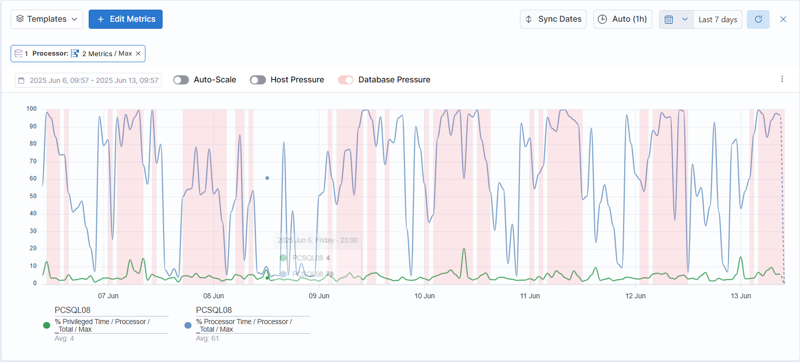
The Chart displayed provides a point-in-time snapshot of performance data. If a Host (one or more) has not been selected, the top three (3) Instances by averages that fall within the specified range of time are displayed, as follows:
- The color-coded stacked lines of the histogram plot the performance trends on a server level for the top three (3) Hosts within the selected date range.
- Use the calendar widget to change the date range (default is last seven (7) days). The selected range is displayed on the card tool bar.
- Use the time widget to change the time interval displayed (Default is one (1) minute; Auto adjusts to show averages).
- Use the slide toggles to filter the Instances displayed.
- To highlight data points, hover the cursor over the stacked, color-coded lines. The marker pop-up will display the selected Metric by date and time for the selected Instance(s). These values are also displayed below the slide toggles.
- To concentrate the display on a specific time range, using the left button, drag the cursor over the display to select the block of time. The histogram will display only that refinement.
Add a Chart
Multiple charts using different filters can be created for comparison. To create a new chart, click the Add Chart button. - When prompted, select one (1) or more Metric from the Metrics drop-down menu and click the Add Series button to populate the chart. The filters and date range selected are displayed on the card tool bar. Each Metric selected is added as a color-coded plot line on the chart.
- When additional charts are created, a Sync Date button added to all the chart headers. Click this button to synchronize the dates between all the charts for comparison.